Included schema Rendering.xsd
|
|
|
|
| Namespace |
No namespace |
|
Properties
|
| attribute form default:
|
unqualified |
| element form default:
|
qualified |
|
|
|
|
|
|
|
|
|
|
| Namespace |
No namespace |
|
Annotations
|
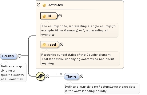
Defines a map style for a specific country or all countries. |
|
|
Diagram
|
|
|
Properties
|
| content:
|
complex |
| minOccurs:
|
0 |
| maxOccurs:
|
unbounded |
|
| Model |
Theme* |
| Children |
Theme |
|
Instance
|
<Country id="" reset="false">
  <Theme id="" reset="false">{0,unbounded}</Theme>
</Country> |
|
|
Attributes
|
| QName |
Type |
Fixed |
Default |
Use |
Annotation |
| id |
CountryId |
|
|
required |
The country code, representing a single country (for example 49 for Germany) or *, representing all countries. |
|
| reset |
xs:boolean |
|
false |
optional |
Resets the current status of this Country element. That means the underlying contents do not inherit anything. |
|
|
|
|
|
|
|
|
|
|
|
| Namespace |
No namespace |
|
Annotations
|
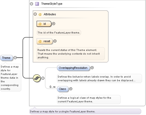
Defines a map style for FeatureLayer theme data in the corresponding country. |
|
|
Diagram
|
|
| Type |
ThemeStyleType |
|
Properties
|
| content:
|
complex |
| minOccurs:
|
0 |
| maxOccurs:
|
unbounded |
|
| Model |
OverlappingResolution{0,1} , Class* |
| Children |
Class, OverlappingResolution |
|
Instance
|
<Theme id="" reset="false">
  <OverlappingResolution forceDisplay="true" maximumDisplacement="16" scope="ALL">{0,1}</OverlappingResolution>
  <Class name="" reset="false">{0,unbounded}</Class>
</Theme> |
|
|
Attributes
|
| QName |
Type |
Fixed |
Default |
Use |
Annotation |
| id |
xs:string |
|
|
required |
The id of the FeatureLayer theme. |
|
| reset |
xs:boolean |
|
false |
optional |
Resets the current status of this Theme element. That means the underlying contents do not inherit anything. |
|
|
|
|
|
|
|
|
|
|
|
| Namespace |
No namespace |
|
Annotations
|
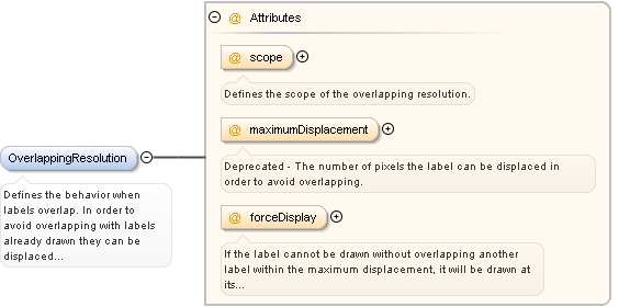
Defines the behavior when labels overlap. In order to avoid overlapping with labels already drawn they can be displaced so that they do not overlap, anymore. This means that labels already drawn will not be repositioned but stay where they are. |
|
|
Diagram
|
|
|
Properties
|
| content:
|
complex |
| minOccurs:
|
0 |
|
|
Attributes
|
| QName |
Type |
Fixed |
Default |
Use |
Annotation |
| forceDisplay |
xs:boolean |
|
true |
optional |
If the label cannot be drawn without overlapping another label within the maximum displacement, it will be drawn at its reference point if forceDisplay is true. Otherwise it will not be drawn. |
|
| maximumDisplacement |
xs:unsignedInt |
|
16 |
optional |
Deprecated - The number of pixels the label can be displaced in order to avoid overlapping. |
|
| scope |
restriction of xs:string |
|
ALL |
optional |
Defines the scope of the overlapping resolution. |
|
|
|
|
|
|
|
|
|
|
|
| Namespace |
No namespace |
|
Annotations
|
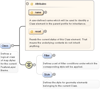
Defines a logical class of map styles for the current FeatureLayer theme. |
|
|
Diagram
|
|
|
Properties
|
| content:
|
complex |
| minOccurs:
|
0 |
| maxOccurs:
|
unbounded |
|
| Model |
ALL(Filter{0,1} Style{0,1})
|
| Children |
Filter, Style |
|
Instance
|
<Class name="" reset="false">
  <Filter reset="false">{0,1}</Filter>
  <Style reset="false">{0,1}</Style>
</Class> |
|
|
Attributes
|
| QName |
Type |
Fixed |
Default |
Use |
Annotation |
| name |
xs:string |
|
|
required |
A user-defined name which will be used to identify a Class element in the parent profile for inheritance. |
|
| reset |
xs:boolean |
|
false |
optional |
Resets the current status of this Class element. That means the underlying contents do not inherit anything. |
|
|
|
|
|
|
|
|
|
|
|
| Namespace |
No namespace |
|
Annotations
|
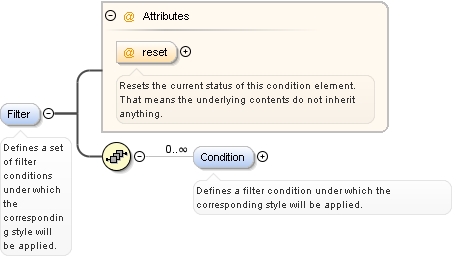
Defines a set of filter conditions under which the corresponding style will be applied. |
|
|
Diagram
|
|
|
Properties
|
| content:
|
complex |
| minOccurs:
|
0 |
|
| Model |
Condition* |
| Children |
Condition |
|
Instance
|
<Filter reset="false">
  <Condition displayClass="" streetType="*" timeRestriction="*">{0,unbounded}</Condition>
</Filter> |
|
|
Attributes
|
| QName |
Type |
Fixed |
Default |
Use |
Annotation |
| reset |
xs:boolean |
|
false |
optional |
Resets the current status of this condition element. That means the underlying contents do not inherit anything. |
|
|
|
|
|
|
|
|
|
|
|
| Namespace |
No namespace |
|
Annotations
|
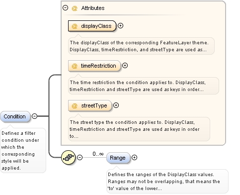
Defines a filter condition under which the corresponding style will be applied. |
|
|
Diagram
|
|
|
Properties
|
| content:
|
complex |
| minOccurs:
|
0 |
| maxOccurs:
|
unbounded |
|
| Model |
Range* |
| Children |
Range |
|
Instance
|
<Condition displayClass="" streetType="*" timeRestriction="*">
  <Range values="">{0,unbounded}</Range>
</Condition> |
|
|
Attributes
|
| QName |
Type |
Fixed |
Default |
Use |
Annotation |
| displayClass |
xs:string |
|
|
required |
The displayClass of the corresponding FeatureLayer theme. DisplayClass, timeRestriction, and streetType are used as keys in order to distinguish filter conditions. Use '*' to specify the default. |
|
| streetType |
restriction of xs:string |
|
* |
optional |
The street type the condition applies to. DisplayClass, timeRestriction and streetType are used as keys in order to distinguish filter conditions. |
|
| timeRestriction |
restriction of xs:string |
|
* |
optional |
The time restriction the condition applies to. DisplayClass, timeRestriction and streetType are used as keys in order to distinguish filter conditions. |
|
|
|
|
|
|
|
|
|
|
|
| Namespace |
No namespace |
|
Annotations
|
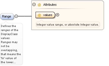
Defines the ranges of the DisplayClass values. Ranges may not be overlapping, that means the 'to' value of the lower range has to be smaller than the 'from' value of the higher range. For example 0-50 and 51-100. Use value '*' or omit the sequence of Range elements to specify a default. |
|
|
Diagram
|
|
|
Properties
|
| content:
|
complex |
| minOccurs:
|
0 |
| maxOccurs:
|
unbounded |
|
|
Attributes
|
| QName |
Type |
Fixed |
Default |
Use |
Annotation |
| values |
restriction of xs:string |
|
|
required |
Integer value range, or absolute Integer value. |
|
|
|
|
|
|
|
|
|
|
|
| Namespace |
No namespace |
|
Annotations
|
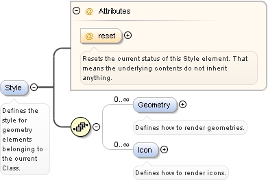
Defines the style for geometry elements belonging to the current Class. |
|
|
Diagram
|
|
|
Properties
|
| content:
|
complex |
| minOccurs:
|
0 |
|
| Model |
Geometry* , Icon* |
| Children |
Geometry, Icon |
|
Instance
|
<Style reset="false">
  <Geometry displayRange="NEVER">{0,unbounded}</Geometry>
  <Icon alignment="CENTER" displayRange="NEVER" transparencyMode="TOP_LEFT_CORNER" url="default.png">{0,unbounded}</Icon>
</Style> |
|
|
Attributes
|
| QName |
Type |
Fixed |
Default |
Use |
Annotation |
| reset |
xs:boolean |
|
false |
optional |
Resets the current status of this Style element. That means the underlying contents do not inherit anything. |
|
|
|
|
|
|
|
|
|
|
|
| Namespace |
No namespace |
|
Annotations
|
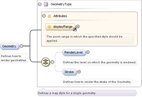
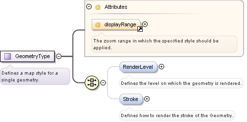
Defines how to render geometries. |
|
|
Diagram
|
|
| Type |
GeometryType |
|
Properties
|
| content:
|
complex |
| minOccurs:
|
0 |
| maxOccurs:
|
unbounded |
|
| Model |
ALL(RenderLevel{0,1} Stroke{0,1})
|
| Children |
RenderLevel, Stroke |
|
Instance
|
<Geometry displayRange="NEVER">
  <RenderLevel renderBase="STREET" renderOffset="+1">{0,1}</RenderLevel>
  <Stroke color="#000000" perpendicularOffset="0px" transparency="0" visible="true" width="2px">{0,1}</Stroke>
</Geometry> |
|
|
Attributes
|
| QName |
Type |
Fixed |
Default |
Use |
Annotation |
| displayRange |
ZoomLevelRange |
|
NEVER |
optional |
The zoom range in which the specified style should be applied. |
|
|
|
|
|
|
|
|
|
|
|
| Namespace |
No namespace |
|
Annotations
|
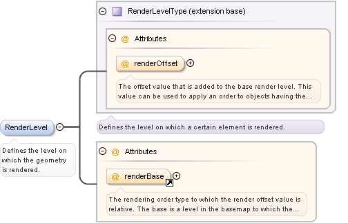
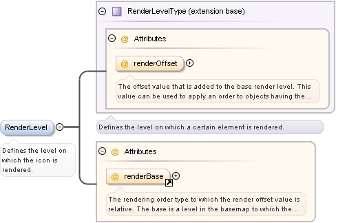
Defines the level on which the geometry is rendered. |
|
|
Diagram
|
|
| Type |
extension of RenderLevelType |
| Type hierarchy |
|
|
Properties
|
| content:
|
complex |
| minOccurs:
|
0 |
|
|
Attributes
|
| QName |
Type |
Fixed |
Default |
Use |
Annotation |
| renderBase |
restriction of xs:string |
|
STREET |
optional |
The rendering order type to which the render offset value is relative. The base is a level in the basemap to which the object in question can be drawn relative to. The render base values do not overlap, e.g. STREET + x does not overlap TOP - y. |
|
| renderOffset |
restriction of xs:string |
|
+1 |
optional |
The offset value that is added to the base render level. This value can be used to apply an order to objects having the same renderBase. |
|
|
|
|
|
|
|
|
|
|
|
| Namespace |
No namespace |
|
Annotations
|
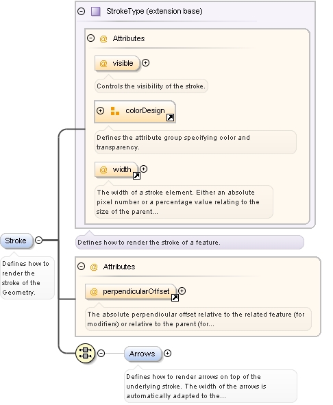
Defines how to render the stroke of the Geometry. |
|
|
Diagram
|
|
| Type |
extension of StrokeType |
| Type hierarchy |
|
|
Properties
|
| content:
|
complex |
| minOccurs:
|
0 |
|
| Model |
ALL(Arrows{0,1})
|
| Children |
Arrows |
|
Instance
|
<Stroke color="#000000" perpendicularOffset="0px" transparency="0" visible="true" width="2px">
  <Arrows drawFill="false" drawStroke="false" fillColor="#ffffff" fillTransparency="0" strokeColor="#ffffff" strokeTransparency="0">{0,1}</Arrows>
</Stroke> |
|
|
Attributes
|
| QName |
Type |
Fixed |
Default |
Use |
Annotation |
| color |
ColorType |
|
#000000 |
optional |
The RGB color as a decimal or hexadecimal value. |
|
| perpendicularOffset |
RenderingSizeType |
|
0px |
optional |
The absolute perpendicular offset relative to the related feature (for modifiers) or relative to the parent (for features). The offset value is either an absolute pixel value, or a percentage value relative to the base element. |
|
| transparency |
PercentValue |
|
0 |
optional |
The transparency in [%]. 0 represents opaque, 100 represents completely transparent. |
|
| visible |
xs:boolean |
|
true |
optional |
Controls the visibility of the stroke. |
|
| width |
RenderingSizeType |
|
2px |
optional |
The width of a stroke element. Either an absolute pixel number or a percentage value relating to the size of the parent or to the default width. For example, 150% width for a line geometry to be rendered on a street results in a line that is 50% wider than the street. |
|
|
|
|
|
|
|
|
|
|
|
| Namespace |
No namespace |
|
Annotations
|
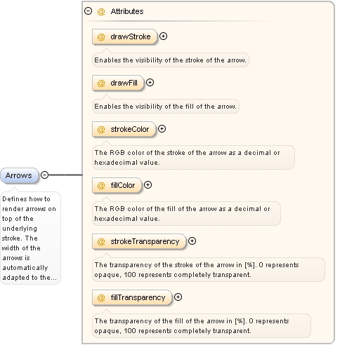
Defines how to render arrows on top of the underlying stroke. The width of the arrows is automatically adapted to the width of the stroke. |
|
|
Diagram
|
|
|
Properties
|
| content:
|
complex |
| minOccurs:
|
0 |
|
|
Attributes
|
| QName |
Type |
Fixed |
Default |
Use |
Annotation |
| drawFill |
xs:boolean |
|
false |
optional |
Enables the visibility of the fill of the arrow. |
|
| drawStroke |
xs:boolean |
|
false |
optional |
Enables the visibility of the stroke of the arrow. |
|
| fillColor |
ColorType |
|
#ffffff |
optional |
The RGB color of the fill of the arrow as a decimal or hexadecimal value. |
|
| fillTransparency |
PercentValue |
|
0 |
optional |
The transparency of the fill of the arrow in [%]. 0 represents opaque, 100 represents completely transparent. |
|
| strokeColor |
ColorType |
|
#ffffff |
optional |
The RGB color of the stroke of the arrow as a decimal or hexadecimal value. |
|
| strokeTransparency |
PercentValue |
|
0 |
optional |
The transparency of the stroke of the arrow in [%]. 0 represents opaque, 100 represents completely transparent. |
|
|
|
|
|
|
|
|
|
|
|
| Namespace |
No namespace |
|
Annotations
|
Defines how to render icons. |
|
|
Diagram
|
|
| Type |
extension of IconType |
| Type hierarchy |
|
|
Properties
|
| content:
|
complex |
| minOccurs:
|
0 |
| maxOccurs:
|
unbounded |
|
| Model |
ALL(RenderLevel{0,1} Anchor{0,1})
|
| Children |
Anchor, RenderLevel |
|
Instance
|
<Icon alignment="CENTER" displayRange="NEVER" transparencyMode="TOP_LEFT_CORNER" url="default.png">
  <RenderLevel renderBase="TOP" renderOffset="+1">{0,1}</RenderLevel>
  <Anchor enabled="false" x="0" y="0">{0,1}</Anchor>
</Icon> |
|
|
Attributes
|
| QName |
Type |
Fixed |
Default |
Use |
Annotation |
| alignment |
Alignment |
|
CENTER |
optional |
The alignment of the icon. The specified position within the icon is placed at its geographic reference point. This setting can be overridden by specifying an anchor point. |
|
| displayRange |
ZoomLevelRange |
|
NEVER |
optional |
The zoom range in which the specified style should be applied. |
|
| transparencyMode |
restriction of xs:string |
|
TOP_LEFT_CORNER |
optional |
Defines how to handle the icon transparency, i.e. which pixels of the icon will be drawn transparently or not be drawn at all. Currently, only one mode is available. |
|
| url |
xs:anyURI |
|
default.png |
optional |
The relative or absolute url of the icon. A relative url refers to the configured icon folder. An absolute url must be an http url in order to download the icon from another server. |
|
|
|
|
|
|
|
|
|
|
|
| Namespace |
No namespace |
|
Annotations
|
Defines the level on which the icon is rendered. |
|
|
Diagram
|
|
| Type |
extension of RenderLevelType |
| Type hierarchy |
|
|
Properties
|
| content:
|
complex |
| minOccurs:
|
0 |
|
|
Attributes
|
| QName |
Type |
Fixed |
Default |
Use |
Annotation |
| renderBase |
restriction of xs:string |
|
TOP |
optional |
The rendering order type to which the render offset value is relative. The base is a level in the basemap to which the object in question can be drawn relative to. The render base values do not overlap, e.g. STREET + x does not overlap TOP - y. |
|
| renderOffset |
restriction of xs:string |
|
+1 |
optional |
The offset value that is added to the base render level. This value can be used to apply an order to objects having the same renderBase. |
|
|
|
|
|
|
|
|
|
|
|
| Namespace |
No namespace |
|
Annotations
|
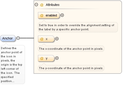
Defines the anchor point of the icon in pixels, the origin is the top left corner of the icon. The specified position within the label is placed at its geographic reference point. |
|
|
Diagram
|
|
|
Properties
|
| content:
|
complex |
| minOccurs:
|
0 |
|
|
Attributes
|
| QName |
Type |
Fixed |
Default |
Use |
Annotation |
| enabled |
xs:boolean |
|
false |
optional |
Set to true in order to override the alignment setting of the label by a specific anchor point. |
|
| x |
xs:int |
|
0 |
optional |
The x-coordinate of the anchor point in pixels. |
|
| y |
xs:int |
|
0 |
optional |
The y-coordinate of the anchor point in pixels. |
|
|
|
|
|
|
|
Complex Type Rendering
|
|
|
|
| Namespace |
No namespace |
|
Annotations
|
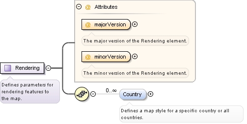
Defines parameters for rendering features to the map. |
|
|
Diagram
|
|
|
Used by
|
|
| Model |
Country* |
| Children |
Country |
|
Attributes
|
| QName |
Type |
Fixed |
Default |
Use |
Annotation |
| majorVersion |
xs:integer |
1 |
|
required |
The major version of the Rendering element. |
|
| minorVersion |
xs:integer |
0 |
|
required |
The minor version of the Rendering element. |
|
|
|
|
|
|
|
Complex Type ThemeStyleType
|
|
|
|
| Namespace |
No namespace |
|
Annotations
|
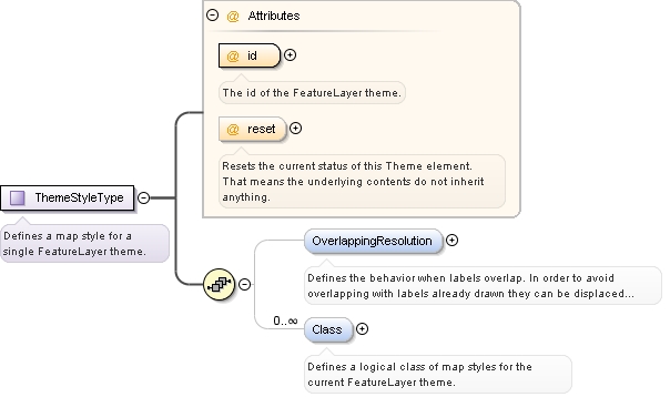
Defines a map style for a single FeatureLayer theme. |
|
|
Diagram
|
|
|
Used by
|
|
| Model |
OverlappingResolution{0,1} , Class* |
| Children |
Class, OverlappingResolution |
|
Attributes
|
| QName |
Type |
Fixed |
Default |
Use |
Annotation |
| id |
xs:string |
|
|
required |
The id of the FeatureLayer theme. |
|
| reset |
xs:boolean |
|
false |
optional |
Resets the current status of this Theme element. That means the underlying contents do not inherit anything. |
|
|
|
|
|
|
|
Complex Type GeometryType
Complex Type RenderLevelType
|
|
|
|
| Namespace |
No namespace |
|
Annotations
|
Defines the level on which a certain element is rendered. |
|
|
Diagram
|
|
|
Used by
|
|
|
Attributes
|
| QName |
Type |
Fixed |
Default |
Use |
Annotation |
| renderOffset |
restriction of xs:string |
|
+1 |
optional |
The offset value that is added to the base render level. This value can be used to apply an order to objects having the same renderBase. |
|
|
|
|
|
|
|
Complex Type StrokeType
|
|
|
|
| Namespace |
No namespace |
|
Annotations
|
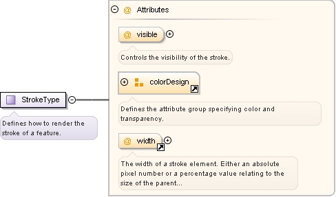
Defines how to render the stroke of a feature. |
|
|
Diagram
|
|
|
Used by
|
|
|
Attributes
|
| QName |
Type |
Fixed |
Default |
Use |
Annotation |
| color |
ColorType |
|
#000000 |
optional |
The RGB color as a decimal or hexadecimal value. |
|
| transparency |
PercentValue |
|
0 |
optional |
The transparency in [%]. 0 represents opaque, 100 represents completely transparent. |
|
| visible |
xs:boolean |
|
true |
optional |
Controls the visibility of the stroke. |
|
| width |
RenderingSizeType |
|
2px |
optional |
The width of a stroke element. Either an absolute pixel number or a percentage value relating to the size of the parent or to the default width. For example, 150% width for a line geometry to be rendered on a street results in a line that is 50% wider than the street. |
|
|
|
|
|
|
|
Simple Type ColorType
|
|
|
|
| Namespace |
No namespace |
|
Annotations
|
The RGB color as a decimal or hexadecimal value. |
|
|
Diagram
|
|
| Type |
restriction of xs:string |
|
Facets
|
| pattern |
#[0-9A-Fa-f]{6}|\d+ |
|
|
|
Used by
|
|
|
|
|
|
|
Simple Type RenderingSizeType
|
|
|
|
| Namespace |
No namespace |
|
Annotations
|
Defines the type for a rendering size, meaning either a relative percentage value or an explicit pixel size. |
|
|
Diagram
|
|
| Type |
restriction of xs:string |
|
Facets
|
|
|
Used by
|
|
|
|
|
|
|
Simple Type ZoomLevelRange
|
|
|
|
| Namespace |
No namespace |
|
Annotations
|
Defines an absolute Integer value or a range of values between 0 and 23, describing a Google zoom level. Special values are NEVER or ALWAYS. |
|
|
Diagram
|
|
| Type |
restriction of xs:string |
|
Facets
|
| pattern |
ALWAYS|NEVER|([0-9]|1[0-9]|2[0-3])(-([0-9]|1[0-9]|2[0-3])){0,1} |
|
|
|
Used by
|
|
|
|
|
|
|
Complex Type IconType
|
|
|
|
| Namespace |
No namespace |
|
Annotations
|
Defines how to render the icon (e.g. a feature label). |
|
|
Diagram
|
|
|
Used by
|
|
| Model |
ALL(RenderLevel{0,1} Anchor{0,1})
|
| Children |
Anchor, RenderLevel |
|
Attributes
|
| QName |
Type |
Fixed |
Default |
Use |
Annotation |
| alignment |
Alignment |
|
CENTER |
optional |
The alignment of the icon. The specified position within the icon is placed at its geographic reference point. This setting can be overridden by specifying an anchor point. |
|
| transparencyMode |
restriction of xs:string |
|
TOP_LEFT_CORNER |
optional |
Defines how to handle the icon transparency, i.e. which pixels of the icon will be drawn transparently or not be drawn at all. Currently, only one mode is available. |
|
| url |
xs:anyURI |
|
default.png |
optional |
The relative or absolute url of the icon. A relative url refers to the configured icon folder. An absolute url must be an http url in order to download the icon from another server. |
|
|
|
|
|
|
|
Simple Type Alignment
|
|
|
|
| Namespace |
No namespace |
|
Annotations
|
Defines the alignment of a label, i.e. the position of the label which matches its geographic reference point. |
|
|
Diagram
|
|
| Type |
restriction of xs:string |
|
Facets
|
| enumeration |
TOP_LEFT |
The top left corner of the label. |
|
| enumeration |
TOP_CENTER |
The center of the top border of the label. |
|
| enumeration |
TOP_RIGHT |
The top right corner of the label. |
|
| enumeration |
LEFT_CENTER |
The center of the left border of the label. |
|
| enumeration |
CENTER |
|
| enumeration |
RIGHT_CENTER |
The center of the right border of the label. |
|
| enumeration |
BOTTOM_LEFT |
The bottom left corner of the label. |
|
| enumeration |
BOTTOM_CENTER |
The center of the bottom border of the label. |
|
| enumeration |
BOTTOM_RIGHT |
The bottom right corner of the label. |
|
|
|
Used by
|
|
|
|
|
|
|
|
|
|
|
| Namespace |
No namespace |
|
Annotations
|
Defines the scope of the overlapping resolution. |
|
| Type |
restriction of xs:string |
|
Properties
|
| use:
|
optional |
| default:
|
ALL |
|
|
Facets
|
| enumeration |
ALL |
Labels of this theme shall not overlap any other label including those of the basemap, e.g. street or town names or street signs. |
|
| enumeration |
ALL_THEMES |
Labels of this theme shall not overlap other labels of this or any other theme, but they may overlap labels of the basemap. |
|
| enumeration |
THIS_THEME |
Labels of this theme shall not overlap other labels of this theme, but they may overlap labels of other themes or the basemap. |
|
| enumeration |
NONE |
Labels of this theme may overlap any other label. |
|
|
|
Used by
|
|
|
|
|
|
|
|
|
|
|
| Namespace |
No namespace |
|
Annotations
|
Deprecated - The number of pixels the label can be displaced in order to avoid overlapping. |
|
| Type |
xs:unsignedInt |
|
Properties
|
| use:
|
optional |
| default:
|
16 |
|
|
Used by
|
|
|
|
|
|
|
|
|
|
|
| Namespace |
No namespace |
|
Annotations
|
If the label cannot be drawn without overlapping another label within the maximum displacement, it will be drawn at its reference point if forceDisplay is true. Otherwise it will not be drawn. |
|
| Type |
xs:boolean |
|
Properties
|
| use:
|
optional |
| default:
|
true |
|
|
Used by
|
|
|
|
|
|
|
|
|
|
|
| Namespace |
No namespace |
|
Annotations
|
Integer value range, or absolute Integer value. |
|
| Type |
restriction of xs:string |
|
Properties
|
|
|
Facets
|
| pattern |
\d+(-\d+){0,1}|\* |
|
|
|
Used by
|
|
|
|
|
|
|
|
|
|
|
| Namespace |
No namespace |
|
Annotations
|
The displayClass of the corresponding FeatureLayer theme. DisplayClass, timeRestriction, and streetType are used as keys in order to distinguish filter conditions. Use '*' to specify the default. |
|
| Type |
xs:string |
|
Properties
|
|
|
Used by
|
|
|
|
|
|
|
|
|
|
|
| Namespace |
No namespace |
|
Annotations
|
The time restriction the condition applies to. DisplayClass, timeRestriction and streetType are used as keys in order to distinguish filter conditions. |
|
| Type |
restriction of xs:string |
|
Properties
|
|
|
Facets
|
| enumeration |
* |
All elements will be taken into account. |
|
| enumeration |
UNRESTRICTED |
Only elements without a restriction in validity will be taken into account. |
|
| enumeration |
RESTRICTED |
Only elements with a restriction in validity will be taken into account. If FeatureLayer/GlobalSettings/@enableTimeDependency is true, this comprises only those which are valid at the given reference time. |
|
| enumeration |
INVALID |
Only elements without a restriction in validity at the given reference time will be taken into account. FeatureLayer/GlobalSettings/@enableTimeDependency must be true.
This setting costs performance. By this reason use it only if needed. |
|
| enumeration |
ALL_VALID |
Only elements with and without a restriction in validity at the given reference time will be taken into account. FeatureLayer/GlobalSettings/@enableTimeDependency must be true.
This setting costs performance. By this reason use it only if needed. |
|
|
|
Used by
|
|
|
|
|
|
|
|
|
|
|
| Namespace |
No namespace |
|
Annotations
|
The street type the condition applies to. DisplayClass, timeRestriction and streetType are used as keys in order to distinguish filter conditions. |
|
| Type |
restriction of xs:string |
|
Properties
|
|
|
Facets
|
| enumeration |
* |
|
| enumeration |
MOTORWAY_FREEWAY |
|
| enumeration |
DUAL_CARRIAGE_HIGHWAY |
|
| enumeration |
SINGLE_CARRIAGE_HIGHWAY |
|
| enumeration |
LOCAL_MAJOR_ROAD |
|
| enumeration |
LOCAL_MINOR_ROAD |
|
| enumeration |
URBAN_STREET |
|
| enumeration |
PEDESTRIAN_ZONE |
|
| enumeration |
FORESTROADS_AND_WALKWAYS |
|
|
|
Used by
|
|
|
|
|
|
|
|
|
|
|
| Namespace |
No namespace |
|
Annotations
|
Resets the current status of this condition element. That means the underlying contents do not inherit anything. |
|
| Type |
xs:boolean |
|
Properties
|
| use:
|
optional |
| default:
|
false |
|
|
Used by
|
|
|
|
|
|
|
|
|
|
|
| Namespace |
No namespace |
|
Annotations
|
The offset value that is added to the base render level. This value can be used to apply an order to objects having the same renderBase. |
|
| Type |
restriction of xs:string |
|
Properties
|
| use:
|
optional |
| default:
|
+1 |
|
|
Facets
|
|
|
Used by
|
|
|
|
|
|
|
Attribute @renderBase
|
|
|
|
| Namespace |
No namespace |
|
Annotations
|
The rendering order type to which the render offset value is relative. The base is a level in the basemap to which the object in question can be drawn relative to. The render base values do not overlap, e.g. STREET + x does not overlap TOP - y. |
|
| Type |
restriction of xs:string |
|
Properties
|
|
|
Facets
|
| enumeration |
STREET |
Represents the rendering order type STREET. |
|
| enumeration |
TOP |
Represents the rendering order type TOP, which means that objects are drawn on top of the map. Nevertheless, several objects with value TOP can be ordered by choosing different renderOffset values. |
|
|
|
Used by
|
|
|
|
|
|
|
|
|
|
|
| Namespace |
No namespace |
|
Annotations
|
Controls the visibility of the stroke. |
|
| Type |
xs:boolean |
|
Properties
|
| use:
|
optional |
| default:
|
true |
|
|
Used by
|
|
|
|
|
|
|
|
|
|
|
| Namespace |
No namespace |
|
Annotations
|
The RGB color as a decimal or hexadecimal value. |
|
| Type |
ColorType |
|
Properties
|
| use:
|
optional |
| default:
|
#000000 |
|
|
Facets
|
| pattern |
#[0-9A-Fa-f]{6}|\d+ |
|
|
|
Used by
|
|
|
|
|
|
|
Attribute @transparency
|
|
|
|
| Namespace |
No namespace |
|
Annotations
|
The transparency in [%]. 0 represents opaque, 100 represents completely transparent. |
|
| Type |
PercentValue |
|
Properties
|
|
|
Facets
|
| maxInclusive |
100 |
|
| minInclusive |
0 |
|
|
|
Used by
|
|
|
|
|
|
|
Attribute @width
|
|
|
|
| Namespace |
No namespace |
|
Annotations
|
The width of a stroke element. Either an absolute pixel number or a percentage value relating to the size of the parent or to the default width. For example, 150% width for a line geometry to be rendered on a street results in a line that is 50% wider than the street. |
|
| Type |
RenderingSizeType |
|
Properties
|
|
|
Facets
|
|
|
Used by
|
|
|
|
|
|
|
|
|
|
|
| Namespace |
No namespace |
|
Annotations
|
Enables the visibility of the stroke of the arrow. |
|
| Type |
xs:boolean |
|
Properties
|
| use:
|
optional |
| default:
|
false |
|
|
Used by
|
|
|
|
|
|
|
|
|
|
|
| Namespace |
No namespace |
|
Annotations
|
Enables the visibility of the fill of the arrow. |
|
| Type |
xs:boolean |
|
Properties
|
| use:
|
optional |
| default:
|
false |
|
|
Used by
|
|
|
|
|
|
|
|
|
|
|
| Namespace |
No namespace |
|
Annotations
|
The RGB color of the stroke of the arrow as a decimal or hexadecimal value. |
|
| Type |
ColorType |
|
Properties
|
| use:
|
optional |
| default:
|
#ffffff |
|
|
Facets
|
| pattern |
#[0-9A-Fa-f]{6}|\d+ |
|
|
|
Used by
|
|
|
|
|
|
|
|
|
|
|
| Namespace |
No namespace |
|
Annotations
|
The RGB color of the fill of the arrow as a decimal or hexadecimal value. |
|
| Type |
ColorType |
|
Properties
|
| use:
|
optional |
| default:
|
#ffffff |
|
|
Facets
|
| pattern |
#[0-9A-Fa-f]{6}|\d+ |
|
|
|
Used by
|
|
|
|
|
|
|
|
|
|
|
| Namespace |
No namespace |
|
Annotations
|
The transparency of the stroke of the arrow in [%]. 0 represents opaque, 100 represents completely transparent. |
|
| Type |
PercentValue |
|
Properties
|
|
|
Facets
|
| maxInclusive |
100 |
|
| minInclusive |
0 |
|
|
|
Used by
|
|
|
|
|
|
|
|
|
|
|
| Namespace |
No namespace |
|
Annotations
|
The transparency of the fill of the arrow in [%]. 0 represents opaque, 100 represents completely transparent. |
|
| Type |
PercentValue |
|
Properties
|
|
|
Facets
|
| maxInclusive |
100 |
|
| minInclusive |
0 |
|
|
|
Used by
|
|
|
|
|
|
|
Attribute @perpendicularOffset
|
|
|
|
| Namespace |
No namespace |
|
Annotations
|
The absolute perpendicular offset relative to the related feature (for modifiers) or relative to the parent (for features). The offset value is either an absolute pixel value, or a percentage value relative to the base element. |
|
| Type |
RenderingSizeType |
|
Properties
|
|
|
Facets
|
|
|
Used by
|
|
|
|
|
|
|
Attribute @displayRange
|
|
|
|
| Namespace |
No namespace |
|
Annotations
|
The zoom range in which the specified style should be applied. |
|
| Type |
ZoomLevelRange |
|
Properties
|
|
|
Facets
|
| pattern |
ALWAYS|NEVER|([0-9]|1[0-9]|2[0-3])(-([0-9]|1[0-9]|2[0-3])){0,1} |
|
|
|
Used by
|
|
|
|
|
|
|
|
|
|
|
| Namespace |
No namespace |
|
Annotations
|
Set to true in order to override the alignment setting of the label by a specific anchor point. |
|
| Type |
xs:boolean |
|
Properties
|
| use:
|
optional |
| default:
|
false |
|
|
Used by
|
|
|
|
|
|
|
|
|
|
|
| Namespace |
No namespace |
|
Annotations
|
The x-coordinate of the anchor point in pixels. |
|
| Type |
xs:int |
|
Properties
|
|
|
Used by
|
|
|
|
|
|
|
|
|
|
|
| Namespace |
No namespace |
|
Annotations
|
The y-coordinate of the anchor point in pixels. |
|
| Type |
xs:int |
|
Properties
|
|
|
Used by
|
|
|
|
|
|
|
|
|
|
|
| Namespace |
No namespace |
|
Annotations
|
The relative or absolute url of the icon. A relative url refers to the configured icon folder. An absolute url must be an http url in order to download the icon from another server. |
|
| Type |
xs:anyURI |
|
Properties
|
| use:
|
optional |
| default:
|
default.png |
|
|
Used by
|
|
|
|
|
|
|
|
|
|
|
| Namespace |
No namespace |
|
Annotations
|
The alignment of the icon. The specified position within the icon is placed at its geographic reference point. This setting can be overridden by specifying an anchor point. |
|
| Type |
Alignment |
|
Properties
|
| use:
|
optional |
| default:
|
CENTER |
|
|
Facets
|
| enumeration |
TOP_LEFT |
The top left corner of the label. |
|
| enumeration |
TOP_CENTER |
The center of the top border of the label. |
|
| enumeration |
TOP_RIGHT |
The top right corner of the label. |
|
| enumeration |
LEFT_CENTER |
The center of the left border of the label. |
|
| enumeration |
CENTER |
|
| enumeration |
RIGHT_CENTER |
The center of the right border of the label. |
|
| enumeration |
BOTTOM_LEFT |
The bottom left corner of the label. |
|
| enumeration |
BOTTOM_CENTER |
The center of the bottom border of the label. |
|
| enumeration |
BOTTOM_RIGHT |
The bottom right corner of the label. |
|
|
|
Used by
|
|
|
|
|
|
|
|
|
|
|
| Namespace |
No namespace |
|
Annotations
|
Defines how to handle the icon transparency, i.e. which pixels of the icon will be drawn transparently or not be drawn at all. Currently, only one mode is available. |
|
| Type |
restriction of xs:string |
|
Properties
|
| use:
|
optional |
| default:
|
TOP_LEFT_CORNER |
|
|
Facets
|
| enumeration |
TOP_LEFT_CORNER |
The color of the top left corner of the icon contains the transparency color, i.e. all pixels which have the same color will not be drawn. If the top left corner shall be drawn, add a border around the icon. The alpha channel of the icon will be ignored. |
|
|
|
Used by
|
|
|
|
|
|
|
|
|
|
|
| Namespace |
No namespace |
|
Annotations
|
Resets the current status of this Style element. That means the underlying contents do not inherit anything. |
|
| Type |
xs:boolean |
|
Properties
|
| use:
|
optional |
| default:
|
false |
|
|
Used by
|
|
|
|
|
|
|
|
|
|
|
| Namespace |
No namespace |
|
Annotations
|
A user-defined name which will be used to identify a Class element in the parent profile for inheritance. |
|
| Type |
xs:string |
|
Properties
|
|
|
Used by
|
|
|
|
|
|
|
|
|
|
|
| Namespace |
No namespace |
|
Annotations
|
Resets the current status of this Class element. That means the underlying contents do not inherit anything. |
|
| Type |
xs:boolean |
|
Properties
|
| use:
|
optional |
| default:
|
false |
|
|
Used by
|
|
|
|
|
|
|
|
|
|
|
| Namespace |
No namespace |
|
Annotations
|
The id of the FeatureLayer theme. |
|
| Type |
xs:string |
|
Properties
|
|
|
Used by
|
|
|
|
|
|
|
|
|
|
|
| Namespace |
No namespace |
|
Annotations
|
Resets the current status of this Theme element. That means the underlying contents do not inherit anything. |
|
| Type |
xs:boolean |
|
Properties
|
| use:
|
optional |
| default:
|
false |
|
|
Used by
|
|
|
|
|
|
|
|
|
|
|
| Namespace |
No namespace |
|
Annotations
|
The country code, representing a single country (for example 49 for Germany) or *, representing all countries. |
|
| Type |
CountryId |
|
Properties
|
|
|
Facets
|
|
|
Used by
|
|
|
|
|
|
|
|
|
|
|
| Namespace |
No namespace |
|
Annotations
|
Resets the current status of this Country element. That means the underlying contents do not inherit anything. |
|
| Type |
xs:boolean |
|
Properties
|
| use:
|
optional |
| default:
|
false |
|
|
Used by
|
|
|
|
|
|
|
|
|
|
|
| Namespace |
No namespace |
|
Annotations
|
The major version of the Rendering element. |
|
| Type |
xs:integer |
|
Properties
|
|
|
Used by
|
|
|
|
|
|
|
|
|
|
|
| Namespace |
No namespace |
|
Annotations
|
The minor version of the Rendering element. |
|
| Type |
xs:integer |
|
Properties
|
|
|
Used by
|
|
|
|
|
|
|
Attribute Group colorDesign
|
|
|
|
| Namespace |
No namespace |
|
Annotations
|
Defines the attribute group specifying color and transparency. |
|
|
Diagram
|
|
|
Used by
|
|
|
Attributes
|
| QName |
Type |
Fixed |
Default |
Use |
Annotation |
| color |
ColorType |
|
#000000 |
optional |
The RGB color as a decimal or hexadecimal value. |
|
| transparency |
PercentValue |
|
0 |
optional |
The transparency in [%]. 0 represents opaque, 100 represents completely transparent. |
|
|
|
|
|
|
|
